
They say a picture is worth a thousand words, but in digital marketing one minute of video is estimated to be worth 1.8 million. Visual marketing is not a passing trend, it is how the human brain actually processes information. The brain handles images far faster than text, and the majority of what reaches it is visual. In an attention economy where the average consumer is exposed to thousands of marketing messages a day, a strong visual strategy is the difference between being remembered and being scrolled past.
The numbers from the field are sharp. Most consumers report making a purchase after watching a product video, and most buyers say image quality was a critical factor in their decision. On mobile-first platforms like Instagram, TikTok and Pinterest, the visual is what wins the first half-second of attention, before any caption is read. That is not a small advantage, it is the entire game.
This guide is the practical follow-up. We will break visual marketing into its hard components, show how to build a consistent brand language, which content types work at each funnel stage, and how to measure whether one image truly sells. Every recommendation is tied to real tools and real workflows you can apply this week.
Why the Brain Reacts to Images Faster Than Text
The human brain evolved to recognize visual patterns long before it learned to read. When a user encounters a post in their feed, the decision to stop or scroll is made in under a second, and is almost always based on the image before the words register. This is why Meta, Google and TikTok built their algorithms around initial watch ratio, often called Stop-the-Scroll, rather than around body copy.
The marketing implication is straightforward. Even the most carefully written message will fail if the visual does not arrest attention in the first second. In campaigns we manage, we repeatedly see that swapping the ad image alone, with no change to copy or audience, can move CTR by double-digit percentages. The visual is the entry filter, the copy closes the deal.
Visual Content Types, and When to Use Each
There is no single correct content type. The right choice is a function of the funnel stage and the goal. A clean product shot on a white background suits a category page and a catalog. A 15-second lifestyle video suits a top-of-funnel awareness ad. A long infographic is ideal for an organic LinkedIn post or a blog that earns search traffic.
Professional photography builds credibility. A buyer who sees a sharp image, correctly lit and in real context, gets a subconscious signal that the brand is serious. Video conveys emotion and shows the product in motion, which is critical in fashion, food and furniture. Campaign graphics with a short headline and clear CTA work when the message must remain memorable in a crowded feed.
Infographics take a complex data point and turn it into a five-second story. Blog posts that use infographics earn far more social shares, and in B2B categories like fintech, health-tech and SaaS, audiences expect to see numbers rendered visually rather than buried in paragraphs.
Building a Consistent Visual Brand Language
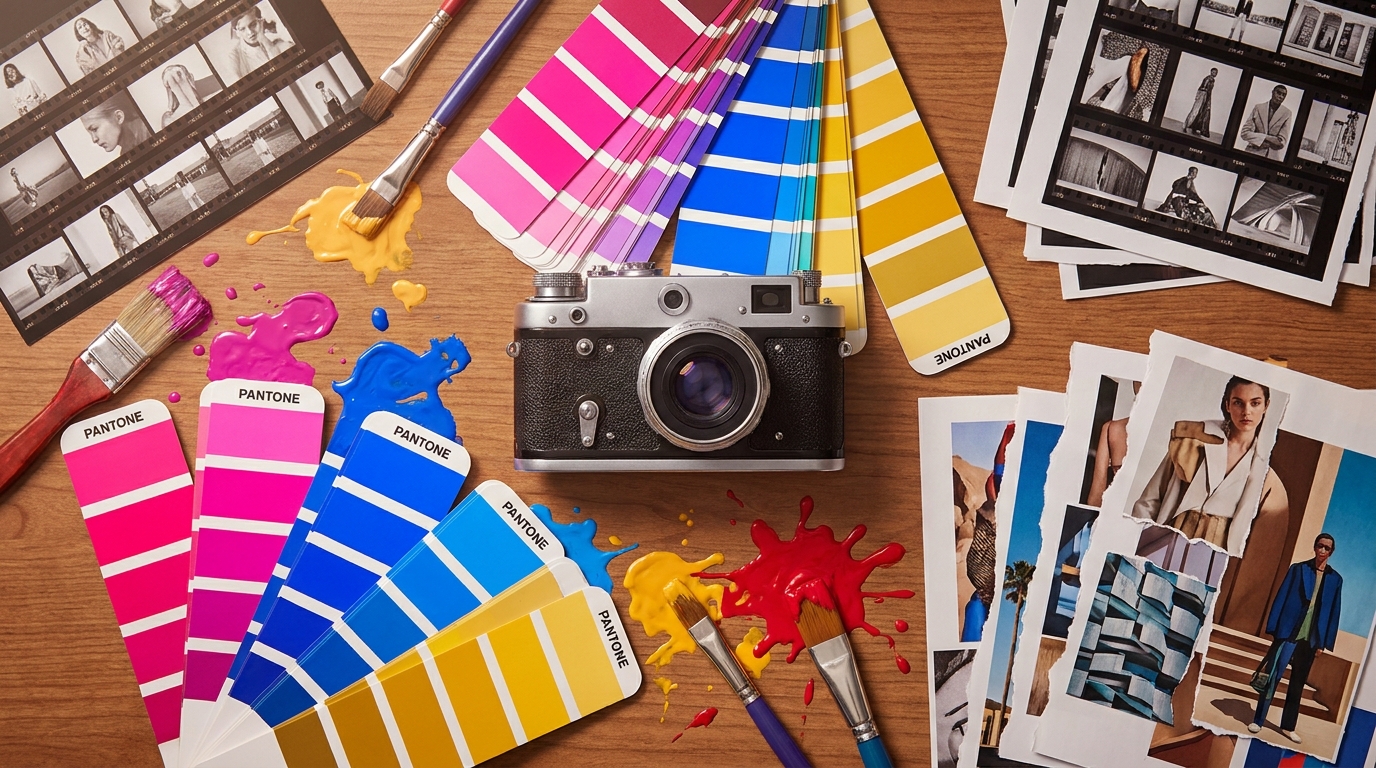
Consistent brand language is the difference between a recognizable brand and a sequence of disconnected posts. It is built on four pillars: a tight color palette, a font family with clear hierarchy, a defined photo or illustration style, and a graphic system of icons and frames. Once these four are locked in a brand document, any designer or content creator can produce work that feels on-brand.
A common trap, especially for early-stage brands, is to build visual identity without a brand guide, producing a feed that looks like five different brands stitched together. The fix does not require a giant budget. A simple 10-page document defining HEX codes, primary and secondary fonts, and logo usage rules will save hundreds of hours and raise perceived credibility immediately.
Rules of Color, Type and Light That Build a Memorable Brand
Color is the most memorable visual component. Strong brand recognition correlates with a meaningful lift in purchase likelihood, and color carries much of that recognition. Choose one primary color, one secondary, and at most two accent colors. More than that creates a fractured feed.
Type sets the tone. A geometric, sharp typeface signals technology and authority. A rounded typeface signals warmth and accessibility. Pick one font for headings and one for body, and follow clear hierarchy rules, with H1 sized roughly two to three times body, and generous white space around copy.
Short Video: Why Reels and TikTok Dominate 2026 Campaigns
Over the last two years, short-form vertical video has become the dominant format on every relevant platform. Meta pushes Reels, TikTok is built around the format natively, and YouTube Shorts is catching up fast. For a modern brand, ignoring short video means giving up hundreds of thousands of impressions that cost less than a standard ad placement.
The structure that consistently performs is fairly fixed. The first three seconds capture attention with motion or a sharp hook. Seconds four through twelve explain the story or the pain. The final second carries a clear call to action. Captions are mandatory, since most viewers scroll on mute, and platform algorithms reward retention.
Across markets, brands that lean into UGC-style content, footage that looks shot by a real user rather than a studio, often see higher conversion rates than polished creative. Audiences recognize authenticity quickly, and rewarding it is now baked into how platforms rank video.
Product Photography That Sells, Not Just Looks Pretty
Professional product photography starts with understanding what the buyer needs to see in order to decide. In fashion that means a shot on a moving model, a fabric close-up, and a back view. In electronics it means a clean white-background image, a dimensions shot, and a use-case image showing the product in a real home or office.
Investing in a high-end camera is not always required. A modern smartphone with good natural light, a clean backdrop, and basic editing in Lightroom Mobile or Capture One can produce results that outperform cheap stock. What is mandatory is consistency: the same background, the same angle, the same color tone across the entire product catalog.
How AI and Firefly Are Reshaping the Creative Toolkit in 2026
Generative AI tools like Adobe Firefly, Midjourney and Canva Magic Studio have rewritten the economics of creative. Work that once took a studio two weeks can now be produced in hours. Agencies have folded these tools into A/B testing pipelines, generating hundreds of ad variants instead of shipping two tired creatives per month.
The downside is real. When everyone uses the same tools, output starts to look generic. The fix is hybrid: use AI for backgrounds, ideation and color variations, but keep authentic photography of the actual product and preserve the elements that make the brand distinctive. AI is an accelerator, not a replacement for visual identity.
Visual Storytelling: Building a Story Without Words
The best visual journeys tell a story without speaking. Three frames, beginning, middle and end, are enough to transmit a message. A classic template: frame one shows the problem, frame two shows the product, frame three shows life after. It works in an ad, in a Reel, and on a homepage.
Globally, brands like Apple, Nike and Patagonia have used visual storytelling for decades to reach hundreds of millions of impressions. The secret is not budget, it is the choice of one visual moment that compresses the brand promise into a single image.
Designing Landing Pages With Visuals That Convert
A landing page is where visuals meet conversion. The hero image is the MVP of the page, it has to communicate what the product does in three seconds, signal credibility, and pull the eye toward the CTA. An image that is unfocused or loads slowly will drive instant bounce.
Basics that pay off: compress images to WebP or AVIF, use srcset for responsive loading, and lazy-load anything below the fold. Tools like Google Lighthouse and WebPageTest will quickly show where heavy visuals are killing performance, and the wins from optimization are often substantial.
A field-tested recommendation: do not lean on the cliche stock image of smiling business people around a laptop. Buyers spot it instantly. Invest in real photography of your team, your office, your product. It is more credible, more memorable, and consistently converts better.
Measurement: How to Know the Visual Is Actually Working
Visual without measurement is professional guessing. The core stack is Meta Ads Manager for paid social, Google Analytics 4 for site behavior, and Hotjar or Microsoft Clarity for heatmaps that show where users stop. Used together, they give a complete picture.
Core metrics: CTR shows whether the creative arrests attention, engagement rate shows whether it holds interest, and landing-page conversion rate shows whether it converts. If CTR is high but conversion is low, the page is the problem, not the visual. If CTR is low, the visual is not working.
Common Visual Mistakes Brands Keep Making
Mistake one: an oversized logo on every post. The logo is not the hero, the product is. Mistake two: too much text on the image. Even though Meta no longer hard-blocks it, the result still looks like a flyer and depresses performance.
Mistake three: visual disconnect between the ad and the landing page. A user who clicks an ad with a blue background and lands on a yellow page feels lost, and bounce climbs. The fix: design the creative and the page as one unit, not two separate projects.
Budget: How Much to Actually Invest in Visuals
There is no universal number, but there is a ratio that works. In most digital campaigns, allocate roughly 15 to 25 percent of media budget to creative, photography, video editing and design. A brand spending heavily on media while spending nothing on fresh creative is burning the budget.
Cost-efficient option: a freelance designer on Behance, Dribbble or Fiverr, working from a clear brief. Mid-tier option: a small creative studio producing a monthly creative package. High-end option: an in-house team with a photographer, editor and designer. The right choice depends on cadence, four creatives a month versus forty.
Practical Conclusion: What to Do in the Next Two Weeks
If you want to lift your brand's visuals to the next level, the first five steps are these. Build a short brand document with colors, fonts and photo direction. Audit existing creatives against data from Meta Ads Manager, what works and what does not. Book a new product or team photoshoot that reflects the real identity.
In week two: build templates in Canva or Figma that anyone on the team can use to stay consistent. Define a visual KPI, for instance CTR above 1.5 percent in paid campaigns, and review it weekly. Treat visuals as an ongoing system, not a one-off project.
Visual is the marketing investment with the highest ROI, because it multiplies the effectiveness of every other investment, media, content, site. Start small, measure, iterate. In three months the difference will show up in the numbers, not just in how the brand feels.