
A campaign that looks visually bad hurts performance before anyone even saw the offer. An image cropped through the logo, a video stretched flat on a 9:16 screen, or text hidden behind a CTA button on mobile — these aren't design problems, they're performance problems. CTR drops, cost per click goes up, and ROAS breaks.
The last year brought major changes to Meta's formats. Reels became the dominant format in Instagram's feed redesign, Facebook Reels gets more organic reach, and tests show that vertical 9:16 video ads beat 1:1 on mobile in most categories. The sizes themselves have shifted, and there are new pitfalls worth knowing about.
This guide consolidates every size, format, and technical constraint accurate for 2026, with an emphasis on what actually drives performance, not just what Meta writes on the help page. Copy the tables, pass them to your creative designer, and make sure the next campaign doesn't fail on something technical.
The Sizes You Need to Know Before Launching a Campaign in 2026
Facebook and Instagram currently support four main aspect ratios: 1:1 (square), 4:5 (portrait), 9:16 (full vertical), and 1.91:1 (landscape). The 1080x1080 square still fits most placements, but it's no longer the optimal choice. Portrait 1080x1350 captures more mobile screen real estate, gets more attention, and that's why Meta Ads auto-recommends it in most cases.
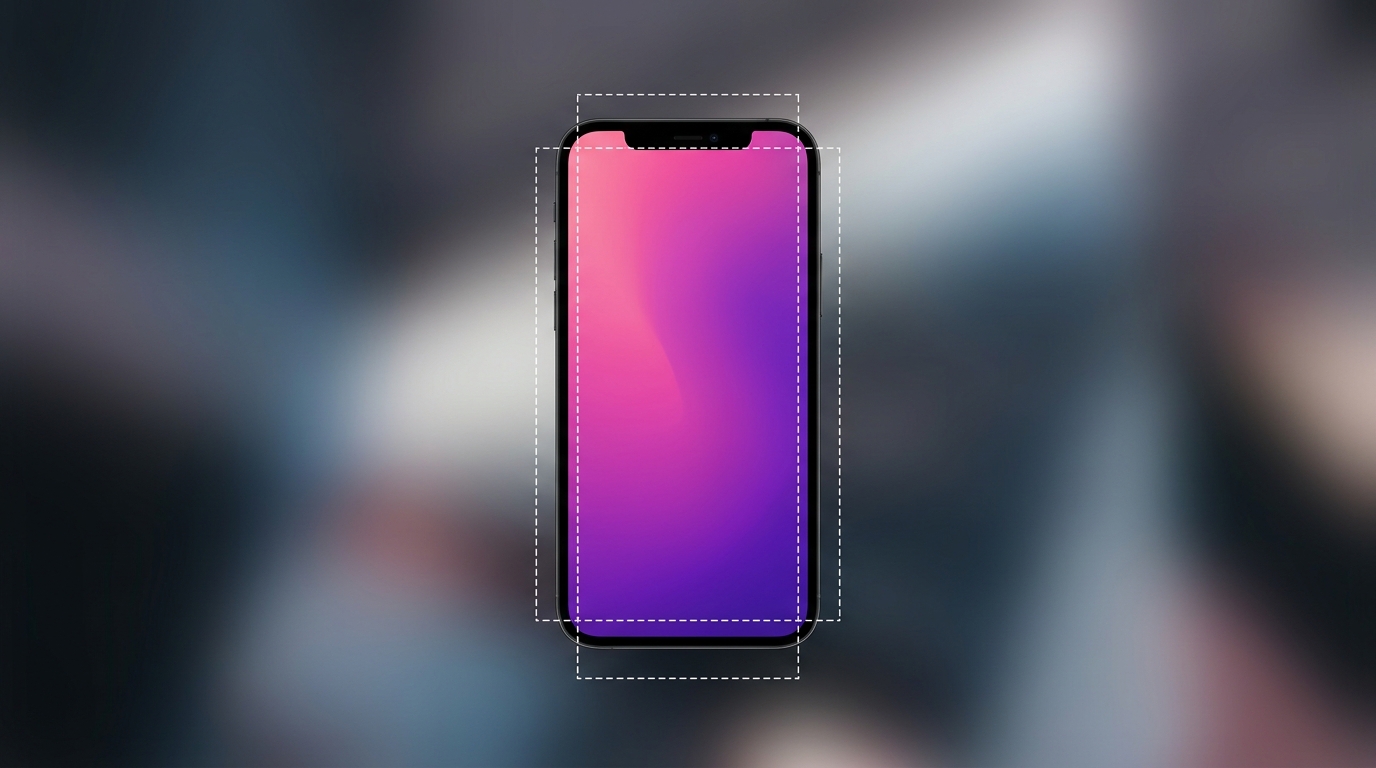
For full vertical ads — Stories and Reels — the standard is 1080x1920 pixels. Watch the safe zone: 250 pixels from the top and 340 from the bottom are covered by the UI (profile, CTA button, caption). Every critical element — logo, price, text CTA — should stay in the center, in a 1080x1420 area that leaves comfortable margins.
For Facebook desktop feed and In-Stream environments, the ideal visual is 1280x720 (16:9), but Meta will scale up if you upload higher resolution. It's always better to work at 1920x1080 and let the algorithm downscale than to upload at minimum and look soft on 4K displays.

Story vs Reel: What's the Visual Difference?
Technically, both formats run on the same canvas: 1080x1920, 9:16, MP4 or MOV. But in practice, there's a real difference. A Story is a personal experience, a 24-hour bubble that someone sees because they tapped a profile. A Reel is discovery content — the algorithm pushes it to people who don't follow you, and the expectations of the creator are different.
The practical difference: Story ads can be flatter, static branding, clean message, prominent CTA. Reels demand pace, jump cuts, motion in the first three seconds. A Reels video that doesn't grab attention within 1.5 seconds loses the viewer before they understood what's happening. The visual format follows the platform: Story tolerates a still, Reels demands motion from frame one.
Feed Ads: Square vs Portrait, Which Wins?
Tests we ran on client campaigns over the past year showed a consistent gap: the 4:5 format (1080x1350) delivers 15-25% more CTR than a square ad with the same creative. The reason is physical — the format takes up more mobile screen and pushes competing ads further down the feed. In a mobile-dominant market, that difference matters.
So why isn't portrait always best? Two cases where square still wins. First: when the creative includes a wide product shot that doesn't crop well to portrait, like a fashion item shot horizontally or a vehicle. Second: when the campaign also runs on Audience Network or placements that don't support full portrait, square gives better visual consistency.
Practical recommendation: work in 1080x1350 as default, and only add a square variant when the creative requires it. Meta Advantage+ Creative lets you upload one asset and auto-generates crops, but the crop algorithm doesn't always protect critical elements. Always review manually before approving.
Video: Bitrate, Codec, and Length — What Meta Doesn't Tell You
Meta says it supports video files up to 4GB and length up to 241 minutes, but that doesn't mean the distribution algorithm will work well with long video. In practice, 75% of Reels video is consumed within 6 seconds, and 95% within 15. A video longer than 30 seconds simply won't reach most of the audience, even with a generous budget.
Technical specs: recommended codec is H.264, MP4 format, minimum 1080p resolution, 30fps framerate (60fps is supported but doesn't help in most categories). Bitrate: at least 8Mbps for horizontal 1080p and at least 4Mbps for vertical. Audio: AAC stereo, 128kbps minimum, and always burn in subtitles because 85% of viewers scroll the feed with sound off.
Common pitfall: people upload a 300MB MOV straight out of CapCut. Meta will accept it but will re-compress and lose quality. Better to export manually to MP4 H.264 with constant bitrate and upload a 30-80MB file. The final visual result is consistently better.
Carousels: When Do They Still Work in 2026?
Carousels became less popular once Reels took over the feed, but they're still strong in specific scenarios: product marketing with multiple variants (fashion, furniture, jewelry), sequential storytelling (before/after), and defining product hierarchy in a dynamic catalog (DPA, Dynamic Product Ads).
Sizes: 1080x1080 per card, consistent across all cards in the campaign. Up to 10 cards — for initial tests use 3-5. Headline per card up to 40 characters, description up to 20. Keep visual consistency: same background, same typography, same color aesthetic — otherwise it looks like a photo dump instead of a story.
Practical tip: in DPA catalogs, don't let Meta auto-pick images if you have quality lifestyle shots. A product on a white background converts well for remarketing, but worse for prospecting carousels. Configure your product set and creative override accordingly.
Text on Image: The 20% Rule Is Dead, What's New?
Anyone who's worked with Meta for years remembers the 20% rule, where text covering more than 20% of an image got the ad blocked or throttled. That rule was officially retired back in 2020, but many designers still build around it. In practice there's no fixed percentage limit, but there is what I'd call a 'readability ceiling.'
What does matter: text that isn't readable on mobile hurts CTR. Minimum font size 24px for main text in a 1080x1080 design, 30px in portrait. High color contrast — if the background is busy, use a black or white overlay at 30-40% opacity. Avoid super-thin fonts, even if they look aesthetic in the editor — on iPhone they vanish.
In Reels and Stories, put text in the lower half of the frame, in the 600px-1500px zone from the top. That's where the viewer's eye naturally lands as they scroll. Don't place text in the bottom 340px — that's the CTA button and caption zone.
Special Formats: Collection, Instant Experience, Playable
The Collection format shows a cover image (1080x1080 or video) and a grid of catalog products below. It's a great format for eCommerce with 20+ items in the catalog, and conversion to product page from it is usually higher than the regular feed. The cover is critical, and video tends to beat static in most tests.
Instant Experience (formerly Canvas) is a full landing page inside Meta that loads instantly and is built from blocks: images, video, buttons, product carousel. Sizes: 1080x1920 for full-screen blocks, 1080x1080 for carousel blocks. Typical use: lifestyle brands that want a long story before the click to the site. It slows the bounce because the click happens inside Facebook.
Playable Ads are relevant mainly for mobile apps and games. Requires HTML5 (ZIP up to 5MB), resolution 480x320 or 320x480. Not relevant for most advertisers, but if you market an app, this is the format with the highest install rate.
Advantage+ Creative: Benefits and Pitfalls
In 2026 Meta is pushing Advantage+ Creative everywhere — it takes your uploaded creative and auto-generates variants in different sizes, with filters, music, and even basic animations. For low-budget campaigns it can save a lot of work, but check things before flipping to live.
The algorithm sometimes crops in the wrong places, especially when a 1:1 asset gets converted to 9:16. Logo or important text can be cut off. Manually review every generated variant before approval — there's a preview button that shows them all. If a variant looks bad, mark it as blocked so it doesn't run.
In Advantage+ Catalog Ads (formerly DPA) the system picks an image from the catalog. If you didn't define a main image at the product level, it might grab a generic one. Make sure every product in the feed has a quality image in the image_link column, and ideally additional_image_link with at least two format variants.
Devices in Use: Why iPhone Renders Differently from Samsung
An ad you designed on a MacBook screen and previewed in Ads Manager will look different on actual devices. OLED screens on iPhone 15 and Galaxy S24 display deeper black, which boosts contrast. iPhone Pro tends to push reds and oranges harder, Samsung leans cold on blues. These differences affect how the ad actually appears.
Practical check: don't approve a campaign based on the Ads Manager preview alone. Use Meta Ads Library to see live ads on different devices, or simply run the ad as a test campaign with $5/day and check on both iPhone and Samsung. Color and contrast issues usually surface immediately.
Dark Mode: Why the Background Changes Everything
Roughly 78% of Instagram users were active in Dark Mode according to industry reports we saw in 2025. An ad with a white background pops aggressively in a dark feed, which can be an advantage or a disadvantage. Advantage: instant attention. Disadvantage: immediately read as advertising, sometimes triggering a quick scroll-past.
Strategy that works: use dark-gray backgrounds or partial transparencies instead of pure white. Brand colors pop on medium backgrounds, and that keeps the ad looking aesthetic in both Dark and Light modes. Always check the ad in both — Facebook doesn't offer a built-in Dark Mode preview.
Stock, AI, and UGC: What Beats Creative?
Stock photos are the only thing worse than a low-resolution ad. Audiences spot stock within a millisecond, CTR collapses, and Meta drops the quality ranking. If there's no production budget, UGC — real user content — outperforms stock that looks professional but generic.
AI content has arrived in force in 2026. Tools like Midjourney v7, Runway Gen-4, and Adobe Firefly let you generate photorealistic images and clips. The market hasn't fully adjusted and there's no broad backlash yet, but Meta now requires AI-content tagging in certain cases — check the current rules before launching a campaign.
UGC is currently the creative with the highest ROAS in most categories, especially in daily-use design and casual style. Vertical video shot handheld on an iPhone, with no planned backdrop, understated, anchored in a personal story, beats studio creative on CPM and conversion. The reason: it doesn't look like an ad.
Summary: Practical Checklist Before Going Live
Before launching the next campaign, run through this list: all creatives at 1080p minimum, vertical assets at 1080x1920, feed at 1080x1350 by default, video at MP4 H.264 with burned-in subtitles, text readable on mobile, safe zones marked in the design, Advantage+ variants reviewed manually, the creative looks good in both Dark and Light mode.
Save this as a team checklist. Every new creative variant should pass through it before going live. Most campaigns I see fail, fail on something technical — soft image at wrong dimensions, video without captions, or text too small for mobile. Not strategy, just the basics that could have been fixed in design.